Reconnect is an app concept designed to tackle the growing issue of social media and screen addiction by offering a digital detox solution that encourages users to step away from their devices and reconnect with both nature and real-life relationships. With the increasing prevalence of screen time and social media use, many people find themselves overwhelmed, distracted, and socially disconnected despite being constantly online. Reconnect aims to break this cycle by reminding users of the importance of connections in their life, and encouraging them to reconnect to outside world by promoting local events, weather-based activities, and encouraging hangouts with friends.
RESEARCH
Problem Statement
As technology become more popular and screen addiction becomes a bigger problem, many people are struggling to connect with their lives outside of technology.
User Interviews
In designing the Reconnect app, I conducted comprehensive user research to understand the behaviors, motivations, and pain points of individuals seeking digital detox and outdoor activities. I researched potential users such as college students who frequently find themselves staring at screens for long periods of time for classes, young people who struggle with addiction to social media, and people who work on their computer often. These interviews exposed what features people would benefit from an app centered around minimizing screen time.
Anaylsis
Many users found that using screen time management systems were ineffective due to the lack of motivation it brougt to stay offline. Interviews also revealed that the motivation to stay offline were more efficient if there were external factors such as visiting friends or going to events.
Content Audit
High Priority
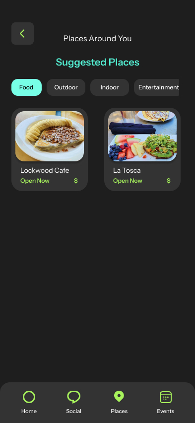
- Recommendations for outdoor and non-digital activities
- Personalized activity suggestions based on preferences
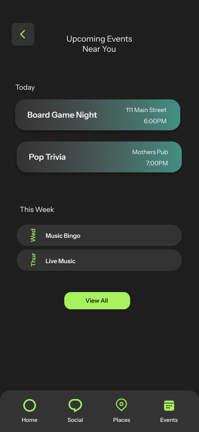
- Friend connections and activity invitations
Medium Priority
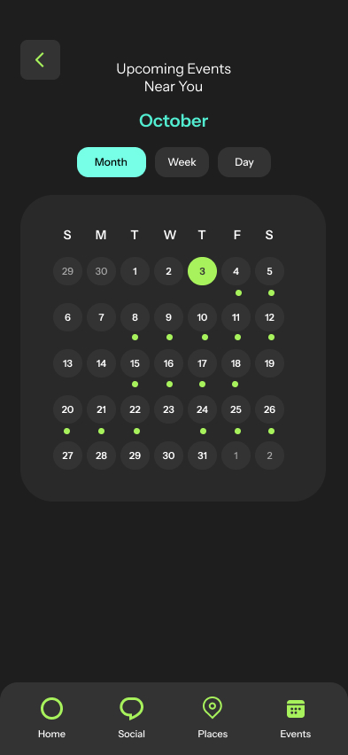
- User profiles and availability calendars
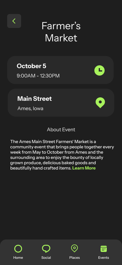
- Local event calendar
- Saved activities or favorite locations
Low Priority
- Reviews and comments on locations
- Photo uploads from activities
- Customizable profile themes or aesthetic settingss
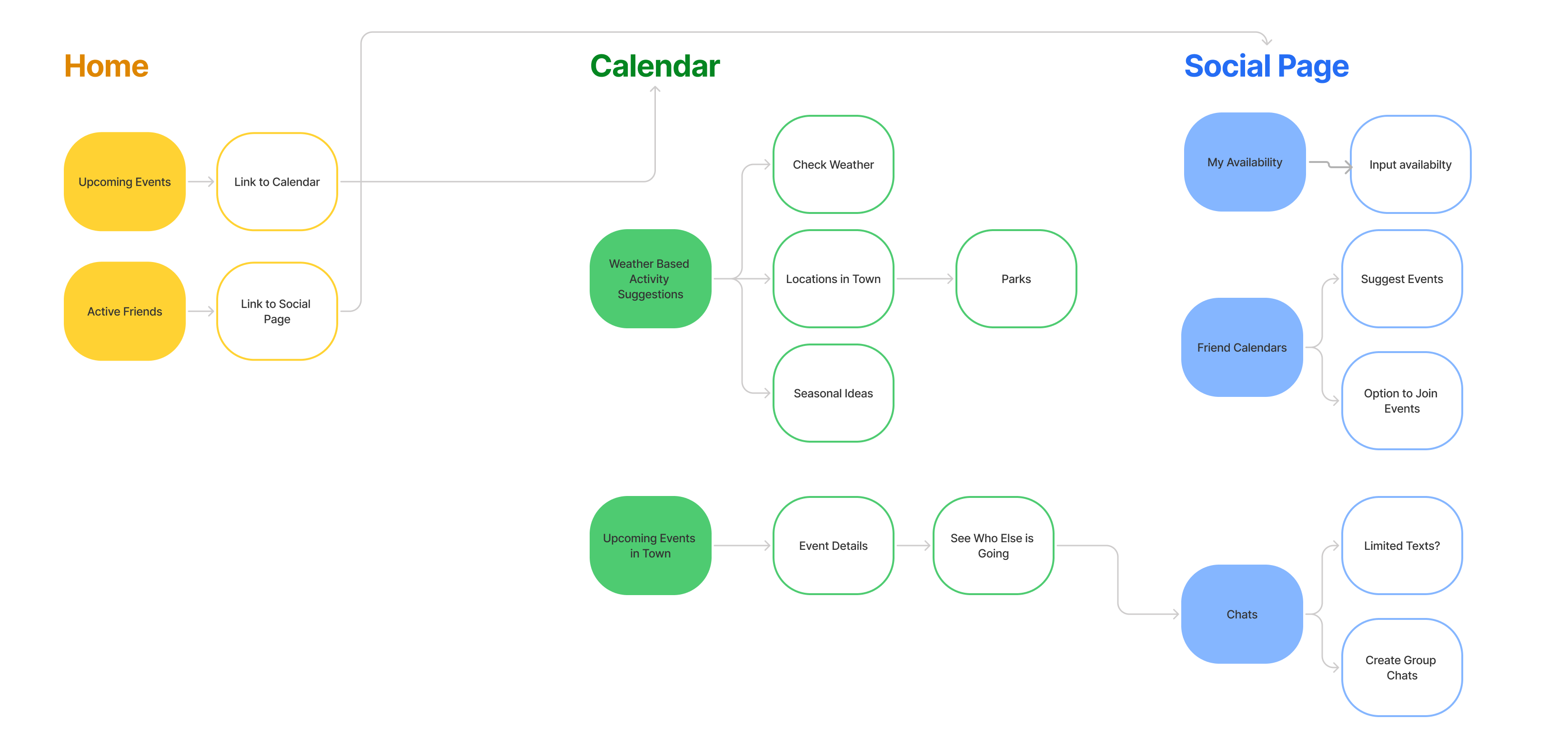
Site Map
After deciding what features would be best suited for user needs, I developed a Site Map of the flow of the app with the necessary screens and features.
IDEATION
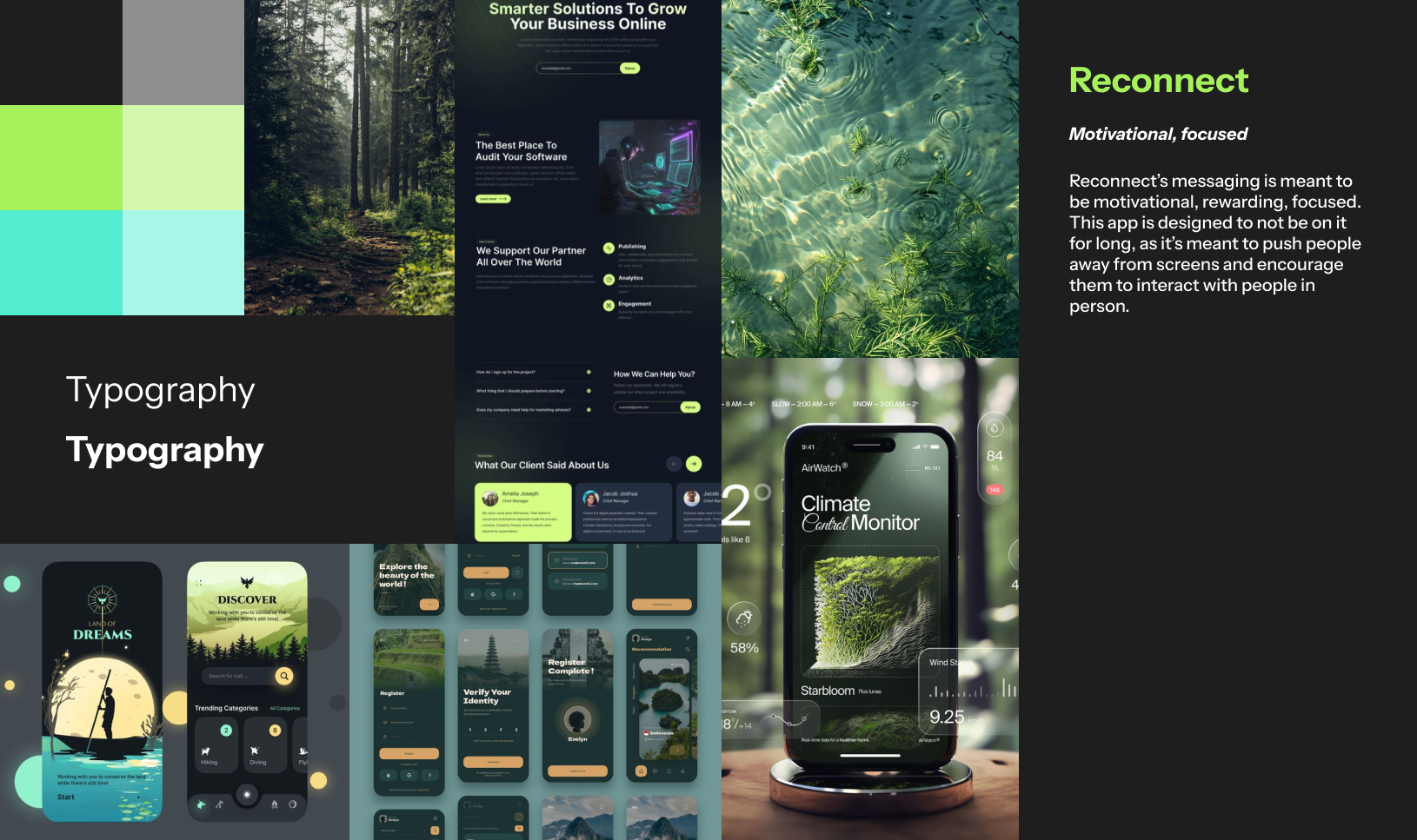
Moodboard
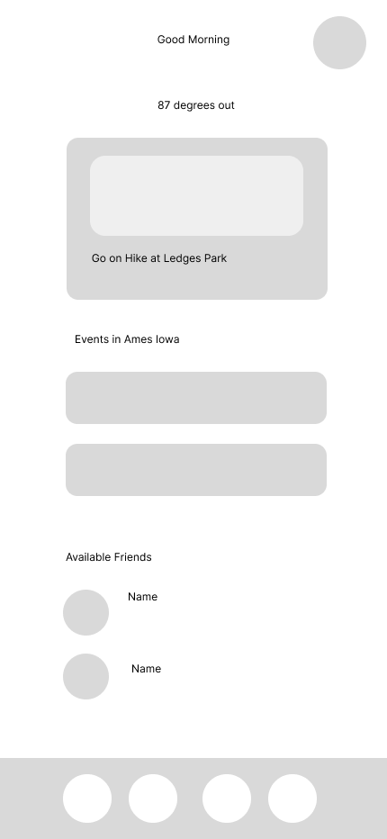
Low Fidelity Wireframes
BRAND IDENTITY
Logo
The gradient from blue to green suggests a transition from digital (blue, often associated with tech) to natural (green, symbolizing nature and growth). This visually reinforces the idea of moving away from screens and toward real-world connections. The three connected circles can represent friends, family, and nature, emphasizing balance and real-life relationships.
Color Palette
This color scheme has a bright, nature- inspired palette that would be a great choice for the Reconnect app concept. Since the app is about digital detox and encouraging users to reconnect with people and nature, these colors—greens, blues, and teal—convey a sense of freshness, tranquility, and connection to the natural world.

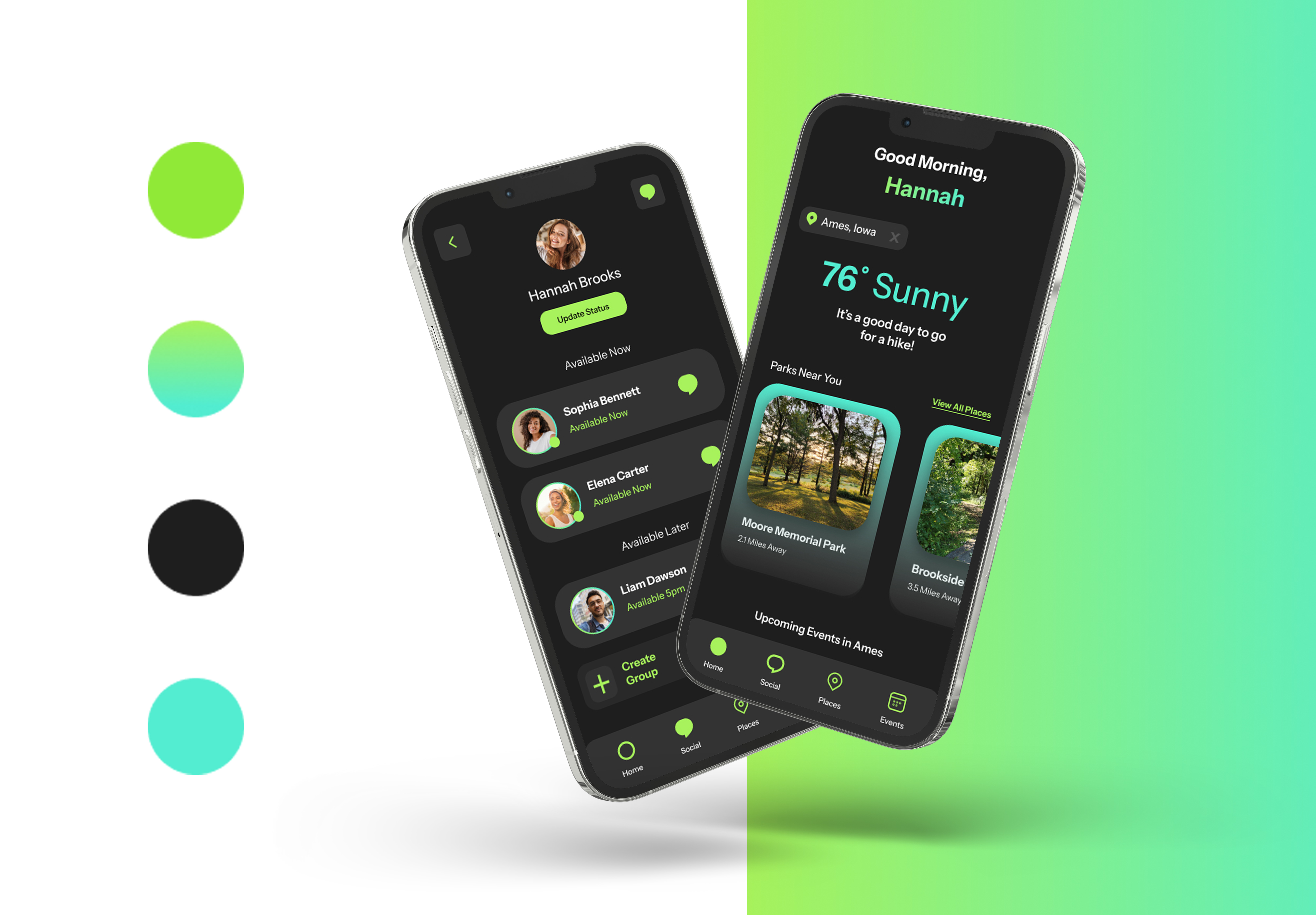
FINAL
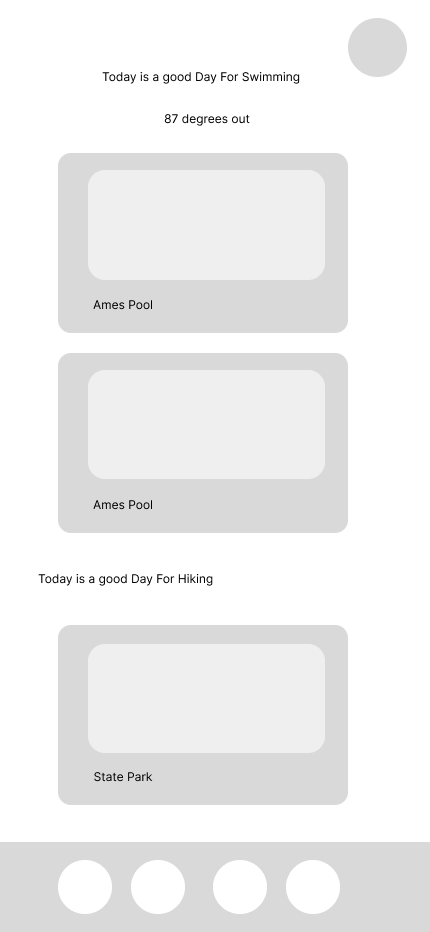
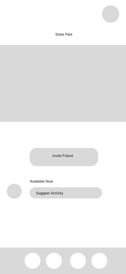
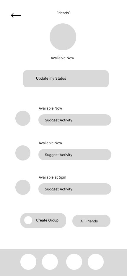
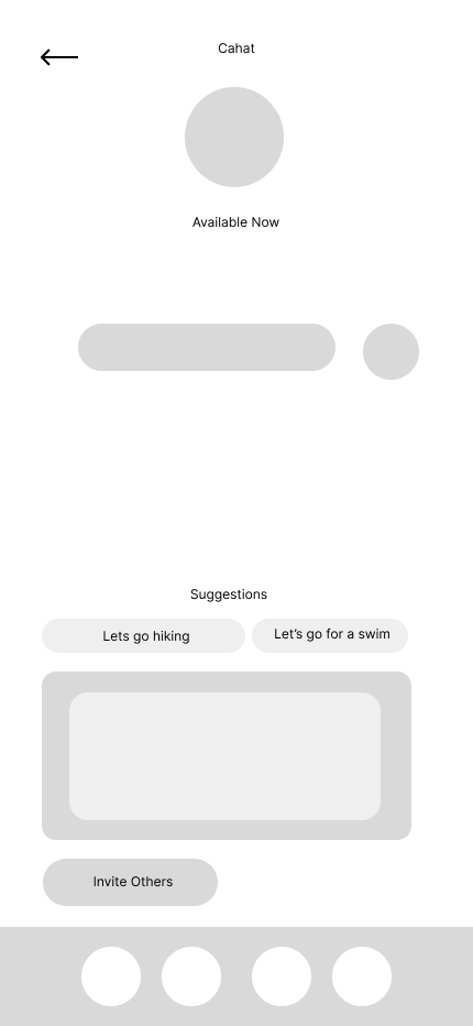
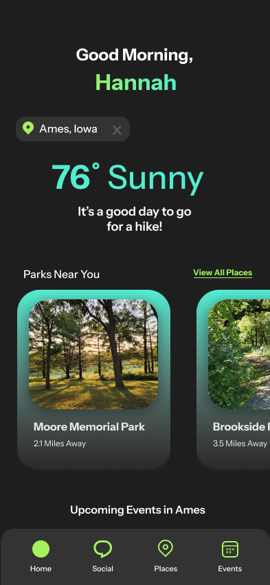
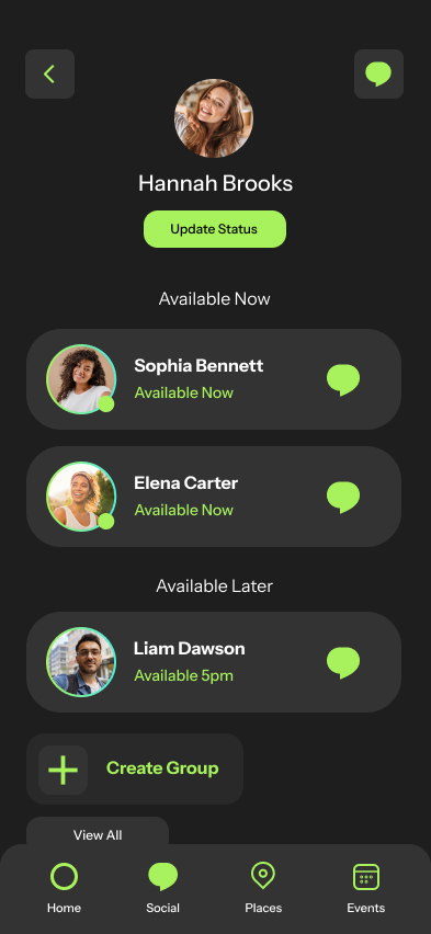
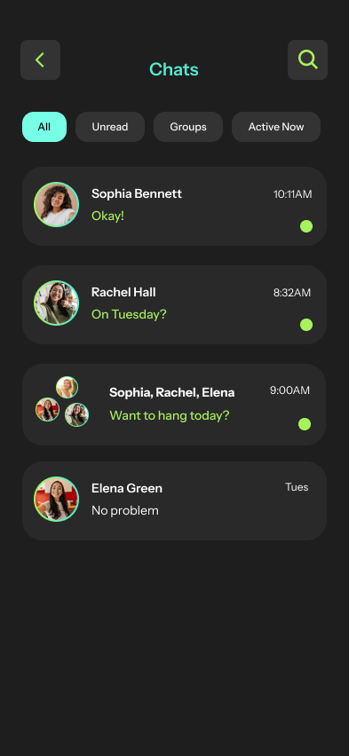
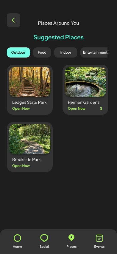
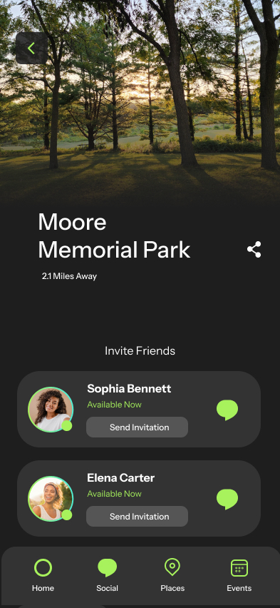
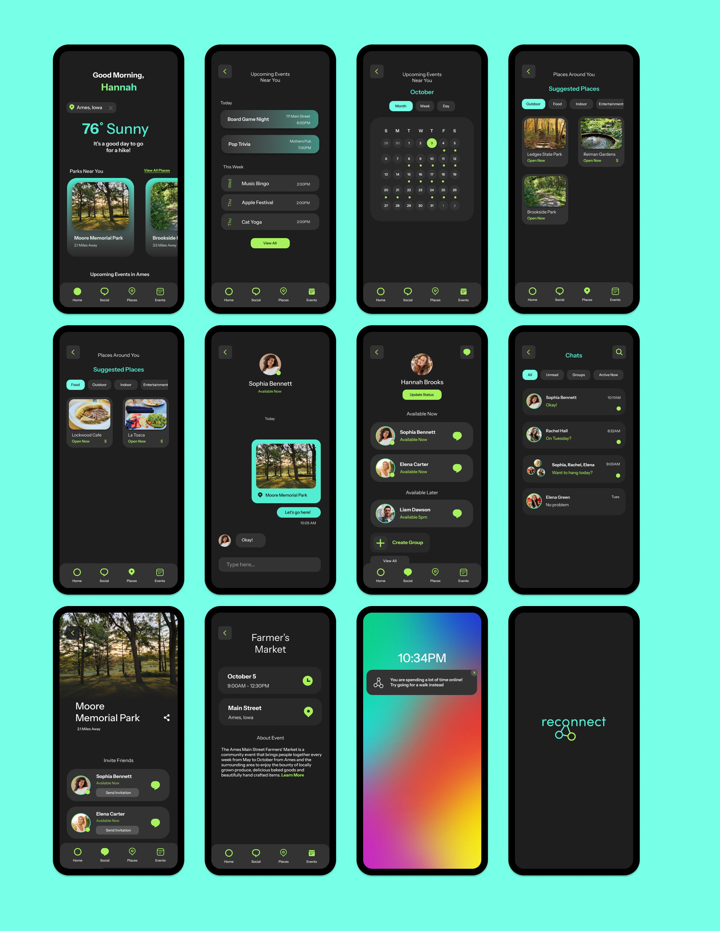
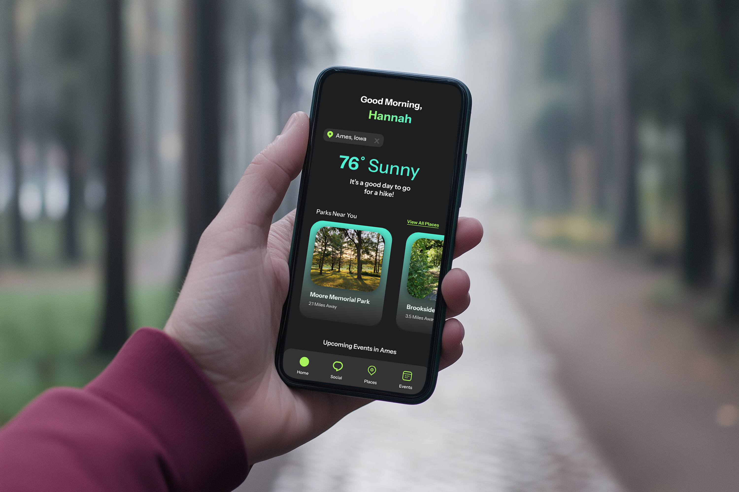
High Fidelity Prototype


Reach Out